Zeles App
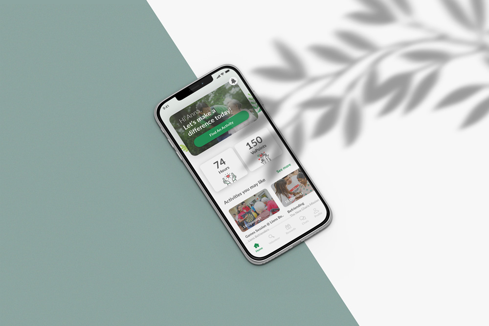
Zeles is a mobile platform that matches volunteers with Non Profit Organization opportunities. Our redesign moved beyond a simple visual update; we rebuilt the experience to be more intuitive, ensuring that finding and joining activities is effortless. The result is a friendly, modern app that makes volunteering more accessible for everyone.
Prototype Link
Digital Experience | Brand Strategy
Non-Profits
UX Researcher, support UI Designer
2019
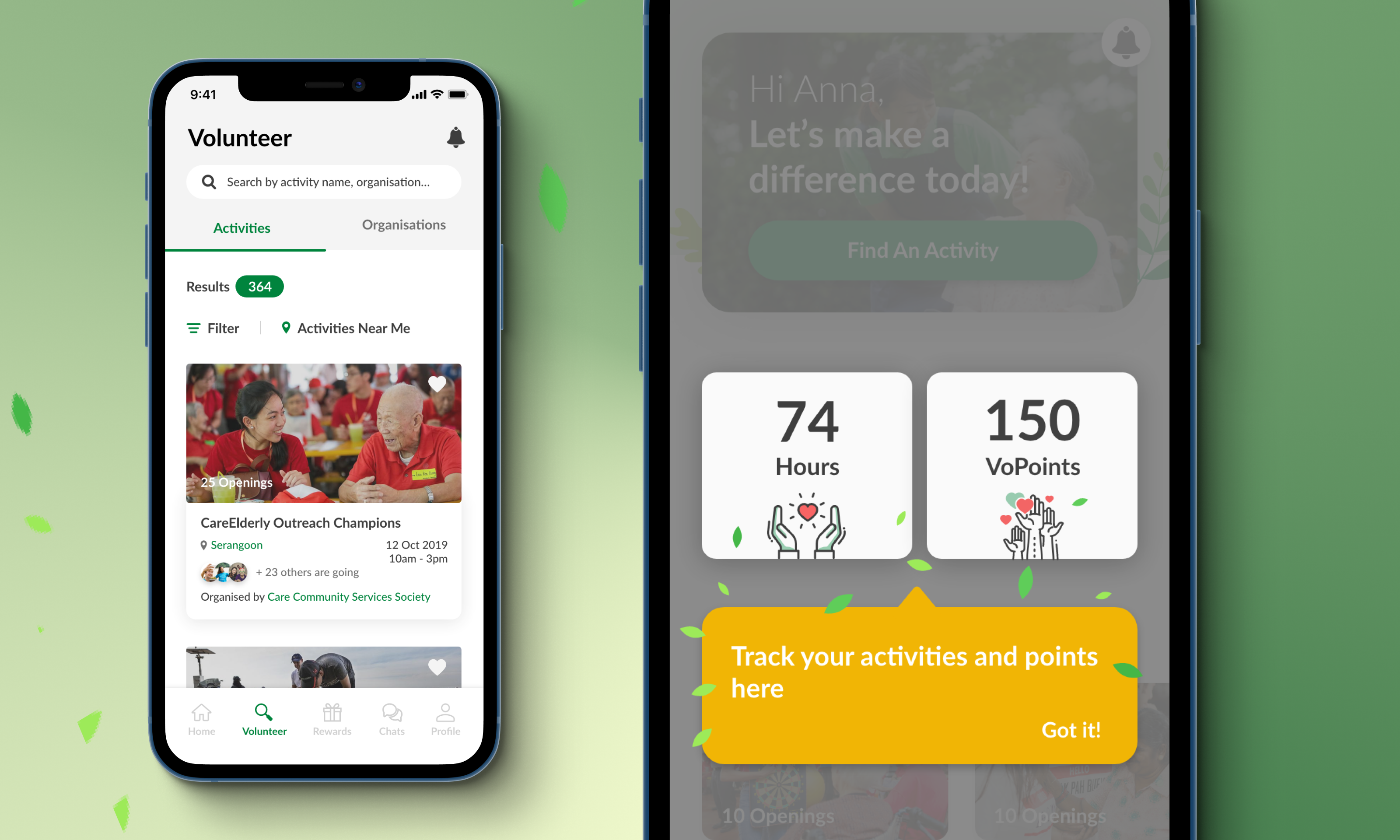
Identifying Key User Groups
We worked with the founders to interview a representative sample of users. This research allowed us to categorize the volunteer base into two clear groups, which became the foundation for our personalized UX strategy:
Regular (Retirees, 50s-60s)
![]()

Ad-hoc (Students/Professionals, 20s-30s)

Inclusive Design: Optimizing for Senior Accessibility
Given that a significant portion of our active user base is aged 50 and above, accessibility was a non-negotiable requirement. We implemented a high-contrast, large-format interface to ensure the app remained frictionless for senior users.︎ Large click target
![]()
Click target height: 45px
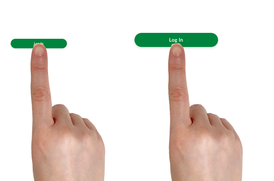
Click target height: 45px
︎ Bigger font size
![]()
Min font size: 16pt
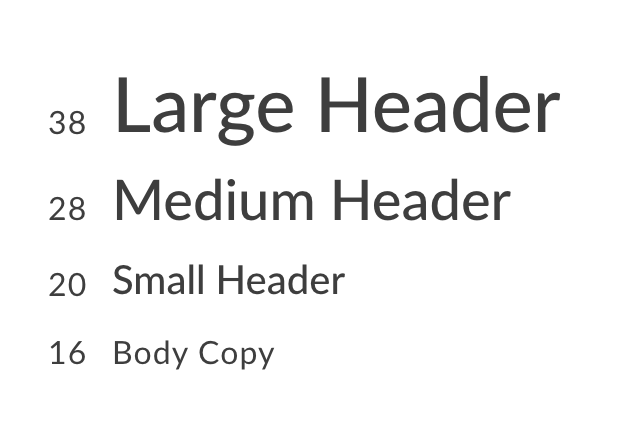
Min font size: 16pt
Sign Up
- Added a clear one-liner to the landing screen so users immediately understand the app’s benefit
- Minimized the registration process to only essential information, reducing the time and effort required for new volunteers to join
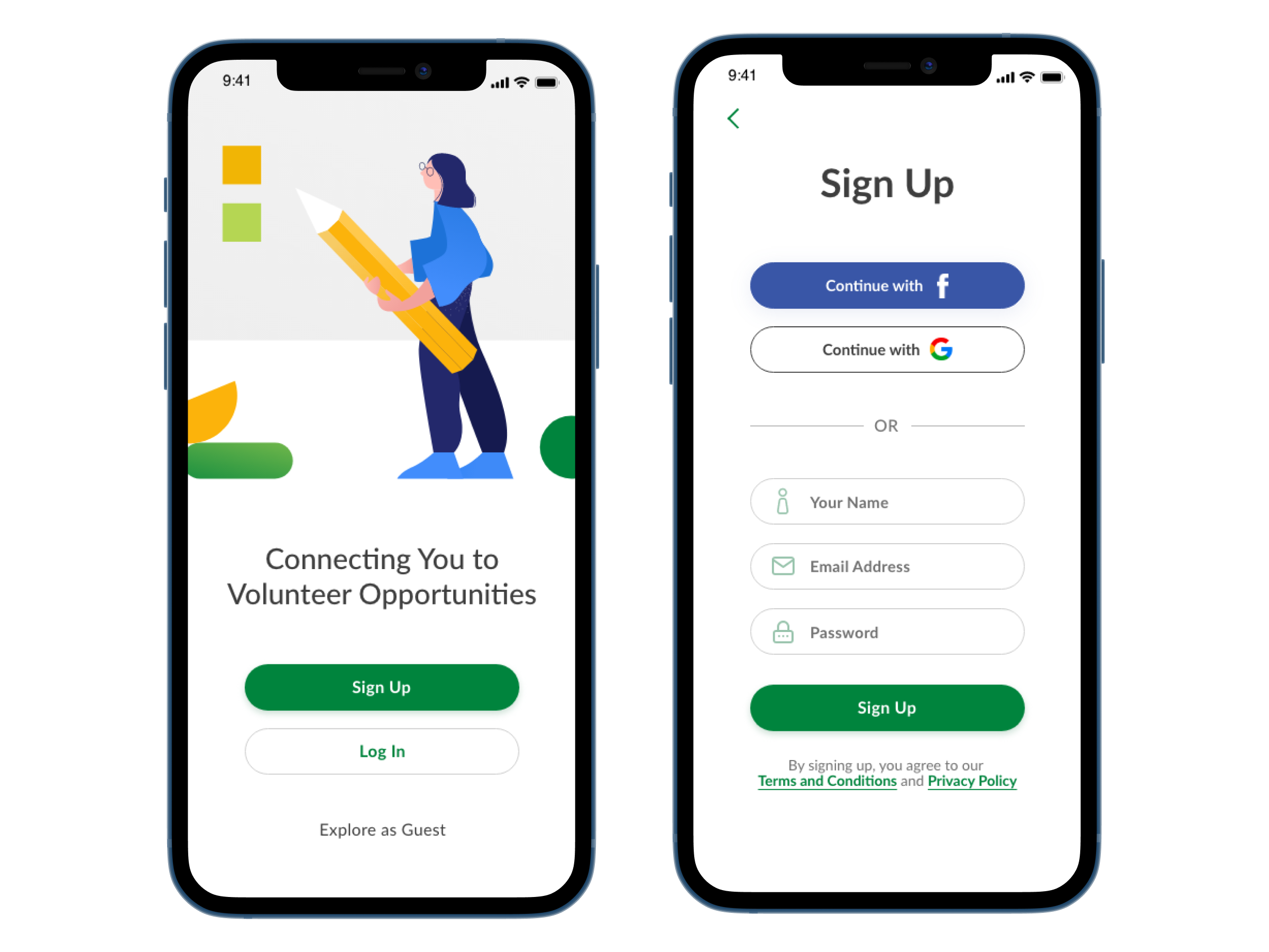
New
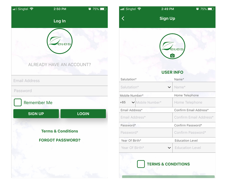
Old
Onboarding
- Users select personal "Causes" to generate a personalized activity feed, increasing day-one engagement.
- Overlay tutorial help learnability for all users.
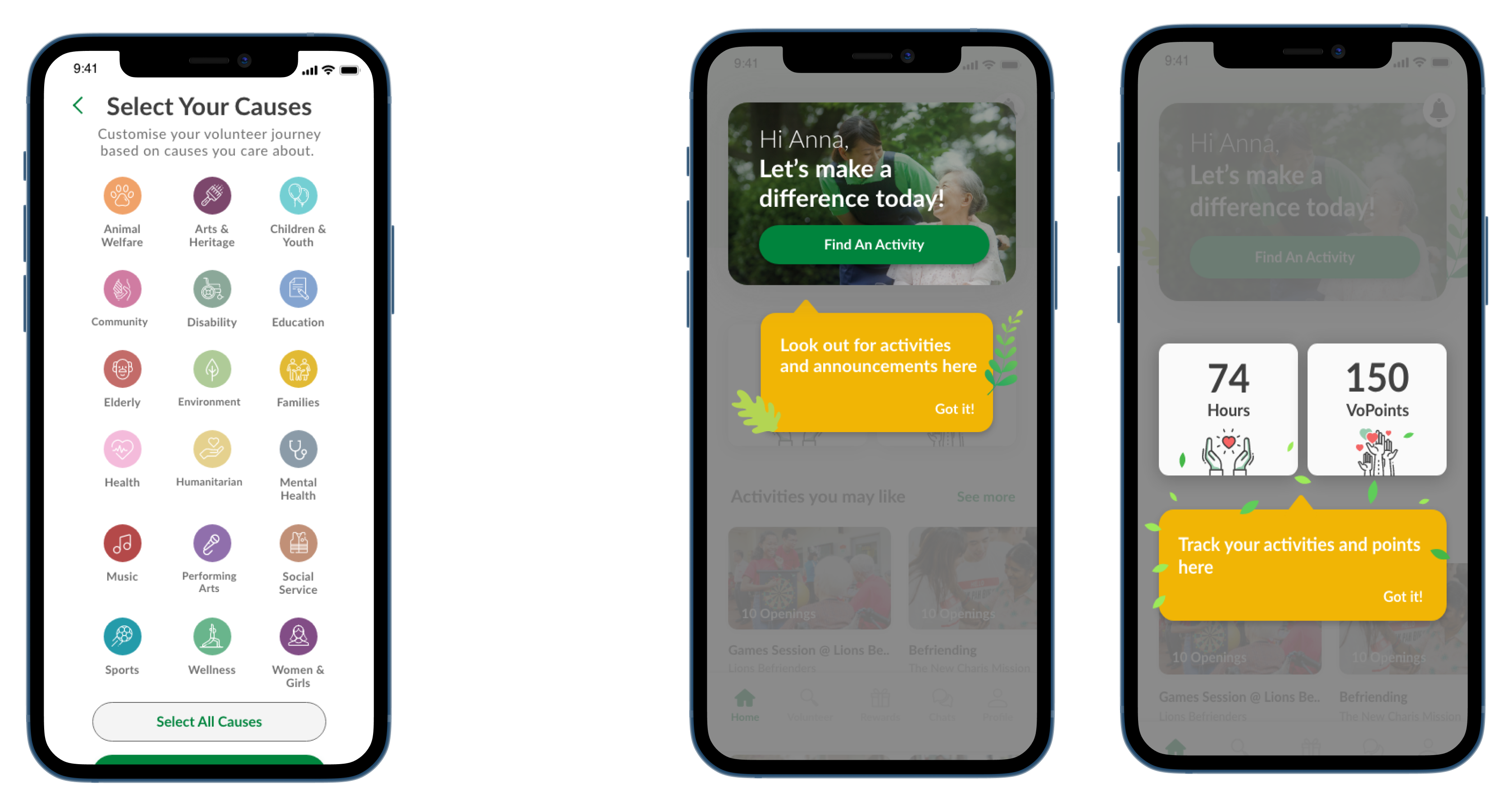
Onboard new users
Decoupling Reward from Achievement Metrics
Unique Behaviour: Users avoided rewards to keep their total points high, fearing a "zeroed-out" profile.Solution: We introduced VoHours as a permanent "Lifetime Impact" counter, allowing VoPoints to function as a spendable currency without devaluing the user’s visible profile and drive long-term user satisfaction.
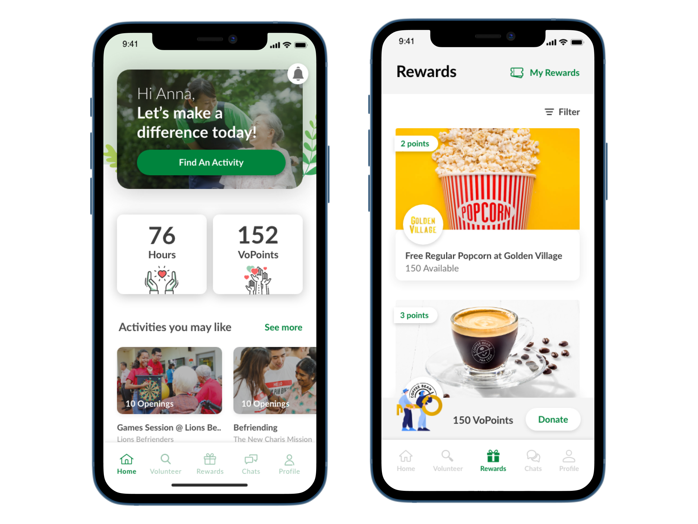
Highlighting total ‘Hours’ next to VoPoints
Information Architecture & Navigation Audit
The legacy architecture suffered from flat hierarchy with excessive top-level menu items. We audited existing IA to eliminate menu redundancy, resolve category overlap, and reduce cognitive load by streamlining the navigation hierarchy.
Old

New

New: Bottom navigation | Old: Hamburger menu
Empty State
Empty state feature call-to-action or short description of the function of the space.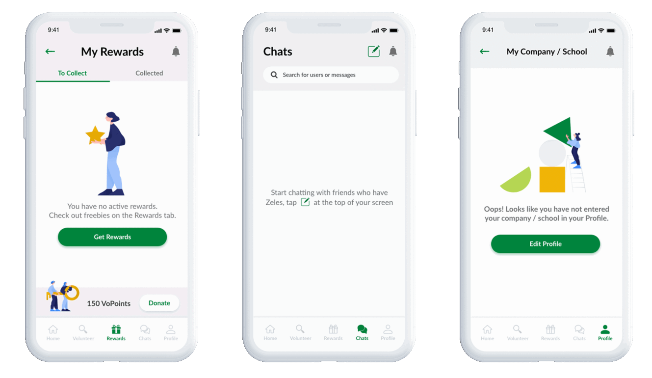
+ 90% Task Completion Rate
- Performance: Dramatically reduced "Fail" and "Succeed with Difficulty" rates.
- Efficiency: Users completed core tasks faster and with higher confidence.
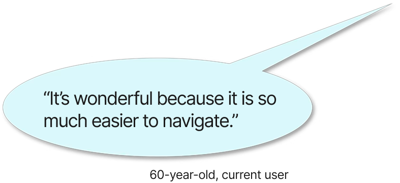
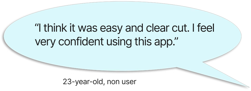
- Satisfaction: 100% positive qualitative feedback, emphasizing high anticipation for launch.
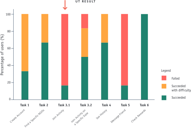 Old
Old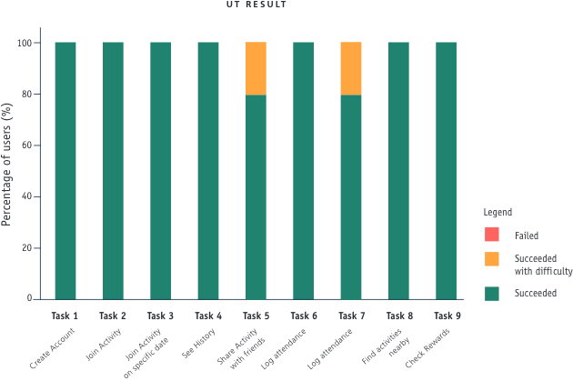
New
Future Roadmap: Scaling Impact & Engagement
- AI-Driven Personalization: Implement a machine-learning recommendation engine to analyze user behavior and surface high-relevance opportunities, moving from manual search to proactive discovery.
- Omnichannel Expansion: Develop a desktop-optimized web platform to complement the mobile experience, catering to users who require a more expansive interface for complex browsing and scheduling.
- Social Ecosystem Integration: Establish seamless API connections with major social platforms to facilitate viral sharing, community advocacy, and friction-less volunteer recruitment.
More projects...


